Dark Mode on iOS 13
Today is Labor Day in the United States (and Labour Day in Canada), a day to celebrate the achievement of the workers who organized to bring about fair and safe conditions for employees — protections that serve as the foundation for the modern workplace.
Labor Day is also the unofficial end of summer; the long weekend acting as a buffer between the lemonades, sunburns, and trashy romance novels of August and the pumpkin spice lattes, flu shots, and textbooks of September.
However, for the stereotypical tech worker, who likes the heat of summer about as much as the concept of “work/life balance”, Labor Day frequently serves as something else entirely: a wake-up call. That, after a lazy summer of ideation and experimentation, it’s once again time to launch new products and ship new features. And if you’re an app developer specifically, you may know today as, “Oh-🤬-it’s-September-and-I-still-haven’t-implemented-Dark-Mode-in-my-app” day.
We’re dedicating this week’s article to anyone out there who’s celebrating this esteemed holiday, whether contemporaneously or in the intervening days until iOS 13 goes GM. We hope that a few quick tips can help shed light against the shade of your looming deadline.
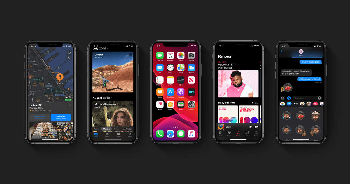
Dark Mode is an appearance preference that tells the system and participating apps to adopt darker color palettes. Whereas an app may display dark text on a light background by default, it may instead show white text on a dark background.
Last year, Dark Mode was the killer feature of macOS 10.14 Mojave, and its contemporaneous launch with Safari 12 rippled throughout the World-Wide Web, gaining steady adoption among websites (like yours truly) and other browsers.
After waiting for what felt like an eternity (but was only, like, a year), Dark Mode is now finally coming to the iPhone and iPad iOS 13. No longer will we have to tinker with Display Accommodations to limit our light pollution when browsing Reddit late at night.
Adopting Dark Mode on iOS
Apple’s done a great job designing a flexible, convenient API and providing excellent documentation to go with it.
Of course, the challenge with Apple technologies is that short of telling you that “you’re holding it wrong”, they’ll rarely acknowledge the existence of prior art or alternatives, let alone provide a transition document that in any way resembles how everyone was doing things before we got an officially-sanctioned API. (Then again, can you really blame them?)
If you were following 100% of Apple’s guidance to the letter, you’d barely have to change a line or code to get your app ready for next week’s special event. But most apps are built on solutions we built for ourselves to bridge the gaps in the SDK, and it may not be clear how to get on the new happy path from there.
Apple’s guidance for adopting Dark Mode is fantastic for new projects but doesn’t quite hit all of the points you should be aware of when preparing your existing app for iOS 13. So without further ado, here’s 6 action items for how to get your app ready for Dark Mode.
#Cancel Color Literals
In Xcode,
a color literal
is code with the prefix #color
that is rendered as a color swatch in the editor.
For example,
the code #color
is rendered in Xcode as .
Color literals can be drag-and-dropped from
the Media Browser in Xcode 10,
which has been consolidated with Snippets into the new Library panel in Xcode 11.
Both color literals and their cousin, image literals, were introduced in support of Xcode Playgrounds. But don’t let their appearance fool you: neither have a place in your app’s codebase.
Dark Mode or not, you can replace all usage of color literals throughout your codebase from the command line:
$ find . -name '*.swift' \
-exec sed -i '' -E 's/#colorBut before you do, you might as well do one better and replace it with something that will stand the test of time.
Nix UIColor Hexadecimal Initializers
Among the most common extensions you’ll find in a
Swiss Army Knife-style CocoaPod
is a category on UIColor that initializes from a hexadecimal string.
Something along the lines of this:
import SwiftySetting aside any qualms about how they’re typically employed and implemented, you’d be well-advised to have these go the way of color literals for the same reasons we described in the previous section.
But worry not! You’ll still have a way to define colors using those hex codes that your designer sent over, as we’ll see in our discussion of named colors.
Find & Replace Fixed Colors
UIColor defines several class properties
that return colors by their common name.
These properties are problematic in iOS 13,
because they don’t automatically adjust for light or dark appearance.
For example,
setting a label’s color to .black looks fine
against the default UITable background,
but it’s illegible when that background becomes black
when Dark Mode is enabled.
To make your app ready for Dark Mode on iOS 13,
you’ll most likely want to replace any instance of the following
UIColor class properties:
redorangeyellowbrowngreencyanbluepurplemagenta
whitelightGray graydarkGray black
Hopefully you aren’t using the built-in
ROYGBIV
UIColor constants for much other than occasional layout debugging,
but chances you’ll probably find a few instances of .black or .white
peppered throughout your codebase somewhere.
In any case,
the easiest change to support Dark Mode would be to
replace any of the aforementioned fixed color properties with
the corresponding system-prefixed adaptable color below:
| Name | API | Light | Dark | ||
|---|---|---|---|---|---|
| Default | Accessible | Default | Accessible | ||
| Red | system |
||||
| Orange | system |
||||
| Yellow | system |
||||
| Green | system |
||||
| Teal | system |
||||
| Blue | system |
||||
| Indigo | system |
||||
| Purple | system |
||||
| Pink | system |
||||
| Gray | system |
||||
| Gray (2) | system |
||||
| Gray (3) | system |
||||
| Gray (4) | system |
||||
| Gray (5) | system |
||||
| Gray (6) | system |
||||
You may notice that this table doesn’t provide direct correspondences for black or white (or brown, but disregard that for now).
Black and white don’t have adaptive colors
because their names would cease to be descriptive in Dark Mode;
if .system existed, it’d pretty much have to be .white
to be visible in a dark color pallet.
Which gets to a deeper point about color management in an era of Dark Mode…
Use Semantic Colors
The best way to ensure consistent rendering of your UI on any device in any appearance mode is to use semantic colors, named according to their function rather than appearance.
Similar to how Dynamic Type uses semantic tags like “Headline” and “Body” to automatically set the most suitable font for the user’s display preferences, semantic colors — or what Apple’s calling UI Element Colors — provide future-proof behavior for your views and controls.
When styling your component,
set the color to the closest UIColor class property below:
- Label Colors
labelsecondaryLabel tertiaryLabel quaternaryLabel - Text Colors
placeholderText - Link Colors
link- Separator Colors
separatoropaqueSeparator - Fill Colors
systemFill secondarySystem Fill tertiarySystem Fill quaternarySystem Fill - Background Colors
systemBackground secondarySystem Background tertiarySystem Background - Grouped Background Colors
systemGrouped Background secondarySystem Grouped Background tertiarySystem Grouped Background
Upgrade Homegrown Semantic Color Palettes
If you’ve given any thought to color management in your app
you’ll have likely landed on some form of the following strategy,
whereby you define semantic colors according to fixed colors
within a namespace or in an extension to UIColor.
For example,
the following example shows how an app might define
UIColor constants from the
Material UI color system
and reference them from semantic UIColor class properties:
import UIKit
extension UIColor {
static var customIf your app uses a pattern like this,
you can make it Dark Mode compatible
using the new
init(dynamic
UIColor initializer in iOS 13 like so:
import UIKit
extension UIColor
static var customNothing about the fixed Material UI color constants has to change
with this approach.
Instead, the semantic color property custom provides a dynamic color
that uses the color most appropriate for the current rendering context.
When Dark Mode is enabled,
a lighter orange is used to contrast against the darker color palette;
otherwise, the behavior is unchanged from the original implementation.
The extra #available check creates some bloat in the implementation,
but it’s a small price to pay for the flexibility this approach provides.
Unfortunately, there’s one crucial shortcoming to using color properties in this way: they can’t be referenced from Interface Builder.
If your app uses either Storyboards or XIBs, the best approach is to use color assets.
Manage Colors with an Asset Catalog
Color assets let you manage colors in an Xcode Asset Catalog in the same way that you do for images, data, or other resources.

To create a color set, open an Asset Catalog in your Xcode project, click the + button on the bottom left-hand corner, and select “New Color Set”. In the Attributes inspector, select “Any, Dark” appearance. Colors are frequently expressed in the form (“#RRGGBB”); you can enter colors in this form by selecting “8-bit Hexadecimal” from the “Input Method” drop-down.

Here,
we’ve done the same as before,
except instead of defining fixed UIColor constants like orange300 in code,
we set those in the color set itself.
Now when it comes time to reference the color asset
by the existing semantic class property,
we can use the UIColor named initializer:
extension UIColor {
@available(iYour opinion about color assets will largely be informed by your preference or dispreference towards specialized Xcode document editors. Some folks like to have everything spelled out in code, while others appreciate the affordances provided by a bespoke UI like the one provided by Xcode for color sets.
In fact, your opinion of color assets is probably concomitant with your feelings about Storyboards — which is convenient, because the killer feature of color assets is that they can be referenced from within Interface Builder. (If you’re not on team IB, then you can safely skip this whole discussion.)
Replace Instances of “Custom Color” in XIBs and Storyboards
The “Custom Color” option in Interface Builder that brings up the macOS system-native color picker suffers the same problem as the color literals and fixed colors we talked about earlier. If you want your XIB-powered views to look good on iOS 13, you’ll need to migrate to named colors.
This can be done easily: select any component in your scene, and you can set its color attribute using the same, named color defined in your Asset Catalog.

For a small project, this can be done by hand for all your screens in under an hour. However, for a larger app, this is a process you’ll want to automate.
XIB Anatomy
Under the hood, XIB and Storyboard files are merely XML files like any other:
<?xml version="1.0" encoding="UTF-8"?>
<document type="com.apple.InterfaceWe wouldn’t want to write this from scratch by hand, but there’s nothing too mysterious going on here.
So consider what happens when you use Xcode to switch the custom background color of the main view to a named color:
<?xml version="1.0" encoding="UTF-8"?>
<document type="com.apple.Interface- ❶
- A new
"Named colors"capability is added as a dependency for opening the document (Xcode uses this to determine whether it can edit files created by newer versions). - ❷
- The
red,green,blue, andalphacomponents on thecolorelement were replaced by a singlenameattribute. - ❸
- A corresponding
namedelement was added to the top-levelColor resourceselement.
Based on this understanding, we should know enough to make this change en masse with our own tooling!
Finding All Custom Colors
The first order of business when migrating your Storyboards and XIBs for Dark Mode is to find all of the instances of custom colors. You could go through each by hand and click each of the visual elements… or you could run the following command:
$ find . \( -name '*.xib' -or -name '*.storyboard' \) \
-exec echo {} \; \
-exec xmlstarlet sel -t \
-m "//color[@colorThis command prints the name of each file
followed by each custom, unnamed color element it found
(denoted by the color attribute).
The resulting list serves as a battle plan for the next phase of attack:
Finding Each Distinct Custom Color
Apps tend to reuse a small set of colors across their views — as they should! By running the following command, you can generate a sorted, unique’d list of every custom color in every XIB or Storyboard:
$ find . \( -name '*.xib' -or -name '*.storyboard' \) \
-exec xmlstarlet sel -t \
-m "//color[@colorSome entries may be equivalent, within a small delta of each other (because, you know… floating-point numbers). To account for account for this, and to transform our output into something easier to work with, you can write the output to a file and process it with a Ruby script like this one:
colors = File.readlines('distinct_colors.txt').map do |line|
    components = line.strip.split(/\s+/).flat_map(&:to_f)
    red, green, blue = components[0..2].map{ |c| (c * 255).floor }
    alpha = (components.last * 100).floor
    [red, green, blue, alpha]
end

colors.uniq.each do |color|
    puts "#%02X%02X%02X (%d%%)" % color
end
From here, the final step is to map each set of RGBA values to the corresponding named color that you want to replace it with.
Replacing Custom Colors
At this point, we’re well beyond the point where shell one-liners seem like a good idea. So here’s a Ruby script we wrote up that makes all of the changes we understand to take place when replacing a custom color with a named color in Interface Builder:
require 'nokogiri'
def name_for_rgba_components(red, green, blue, alpha)
case format('#%02X%02X%02X%02X', red, green, blue, alpha)
# Return named color matching RGBA components
# e.g. "#F8CB00FF" => "Accent"
end
end
def name_for_white_and_alpha_components(white, alpha)
# Return named color matching white and alpha components
# e.g. 0.9 => "Off-White"
end
# Process each Storyboard and XIB file
Dir['**/*.{storyboard,xib}'].each do |xib|
doc = Nokogiri::XML(File.read(xib))
names = []
# Collect each custom color and assign it a name
doc.xpath('//objects//color').each do |color|
next if color['name']
name = nil
color_space = color['color*Phew!*
If you’ve been facing down a deadline for Dark Mode at the expense of enjoying one last hurrah of summer, we hope that this article was able to get you out of the office today.
Its ironic that so many of us are eschewing our holiday weekend in a scramble to get our apps ready for the annual NMOS GM. But if it’s any consolation, know that Apple engineers rarely get to observe Memorial Day — the unofficial start of summer in America — in the run-up to WWDC.