UIAccessibility
We all want to help one another, human beings are like that.
You know what I wish everyone would copy from Apple? Their assistive technologies.
iPhones and iPads–magical as they are–become downright life-changing for individuals with disabilities and their families because of Apple’s commitment to accessibility. Look no further than the WWDC 2012 Introduction Video, which opens with Per Busch, a blind man who walks the woods of Kassel, Germany with the aid of Ariadne GPS. It’s a lovely reminder of the kind of impact our work can have on others.
Accessibility, like internationalization, is one of those topics that’s difficult to get developers excited about. But as you know, NSHipster is all about getting developers excited about this kind of stuff. Let’s get started:
UIAccessibility is an informal protocol in UIKit that provides accessibility information about user interface elements. This information is used by VoiceOver and other assistive technologies to help users with disabilities interact with your application.
All of the standard views and controls in UIKit implement UIAccessibility, so applications are accessible by default. As a result, the task of improving the accessibility of your application is one of minor adjustments rather than wholesale re-implementation.
Here’s a list of all of the properties in UIAccessibility:
accessibilityLabel accessibilityHint accessibilityValue accessibilityLanguage accessibilityTraits accessibilityFrame accessibilityActivation Point accessibilityElements Hidden accessibilityView Is Modal
Enabling Accessibility
Before we go any further, take a couple minutes to play with VoiceOver, and understand how accessibility information is conveyed to the user. Open the Settings app, tap General, scroll to the bottom and tap Accessibility. In Accessibility, you’ll see settings for assistive technologies grouped by category: Vision, Hearing, Learning, and Physical & Motor.
Tap VoiceOver, and then tap the VoiceOver switch to turn it on. An alert will pop up telling you that enabling VoiceOver changes the way you control your device. Dismiss the alert, and now VoiceOver is now enabled on your device.
Don’t Panic–unlike setting your device to another language, there’s no real risk of not being able to figure out how to turn VoiceOver off.
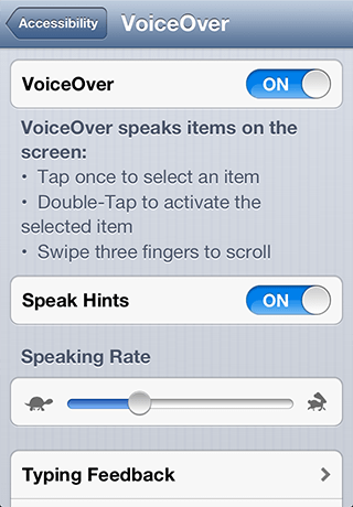
Using the device in VoiceOver mode is a bit different than you’re used to:
- Tap once to select an item
- Double-Tap to activate the selected item
- Swipe with three fingers to scroll
Press the Home button and start exploring!
You’ll notice that all of the stock Apple apps–Messages, Calendar, Weather–each is fully-usable in VoiceOver mode. Heck, even Camera is usable, with VoiceOver telling you where faces are in your camera’s viewport!
By contrast (perhaps), try some of the apps you’ve downloaded from the App Store. You may be surprised that some (but certainly not all) of the most visually-stunning apps, with all of their custom controls and interactions are completely unusable in this mode.
So now that you have an idea of what you’re working with, let’s talk about implementation:
Label & Hint
If there was just one thing you could do to improve the accessibility of your app, paying attention to accessibility labels and hints of UI elements would be it.
Accessibility labels and hints tell VoiceOver what to say when selecting user interface elements. This information should be helpful, but concise.
-
accessibilityidentifies a user interface element. Every accessible view and control must supply a label.Label -
accessibilitydescribes the results of interacting with a user interface element. A hint should be supplied only if the result of an interaction is not obvious from the element’s label.Hint
The Accessibility Programming Guide provides the following guidelines for labels and hints:
Guidelines for Creating Labels
If you provide a custom control or view, or if you display a custom icon in a standard control or view, you need to provide a label that:
- Very briefly describes the element. Ideally, the label consists of a single word, such as Add, Play, Delete, Search, Favorites, or Volume.
- Does not include the type of the control or view. The type information is contained in the traits attribute of the element and should never be repeated in the label.
- Begins with a capitalized word. This helps VoiceOver read the label with the appropriate inflection.
- Does not end with a period. The label is not a sentence and therefore should not end with a period.
-
Is localized. Be sure to make your application available to as wide an audience as possible by localizing all strings, including accessibility attribute strings. In general, VoiceOver speaks in the language that the user specifies in International settings.
Guidelines for Creating Hints
The hint attribute describes the results of performing an action on a control or view. You should provide a hint only when the results of an action are not obvious from the element’s label.
- Very briefly describes the results. Even though few controls and views need hints, strive to make the hints you do need to provide as brief as possible. Doing so decreases the amount of time users must spend listening before they can use the element.
- Begins with a verb and omits the subject. Be sure to use the third-person singular declarative form of a verb, such as “Plays,” and not the imperative, such as “Play.” You want to avoid using the imperative, because using it can make the hint sound like a command.
- Begins with a capitalized word and ends with a period. Even though a hint is a phrase, not a sentence, ending the hint with a period helps VoiceOver speak it with the appropriate inflection.
- Does not include the name of the action or gesture. A hint does not tell users how to perform the action, it tells users what will happen when that action occurs.
- Does not include the name of the control or view. The user gets this information from the label attribute, so you should not repeat it in the hint.
- Is localized. As with accessibility labels, hints should be available in the user’s preferred language.
Traits
If you are using custom controls, or have taken liberties with non-standard use of a standard control, you should make sure to specify the correct accessibility traits.
Accessibility traits describe a set of traits that characterize how a control behaves or should be treated. Examples include distinctions like:
- Button
- Link
- Search Field
- Keyboard Key
- Static Text
- Image
- Plays Sound
- Selected
- Summary Element
- Updates Frequently
- Causes Page Turn
- Not Enabled
- None
The accessibility property takes a bitmask of UIAccessibility values, which can be combined in ways specified in the documentation.
For example, if a custom button control displays an image and plays a sound when tapped, you should define the traits for “Button”, “Image”, and “Plays Sound”. Or, if you were to use a UISlider for purely decorative purposes, you should set the “Not Enabled” trait.
Frame & Activation Point
As a general rule, the cleverness of a custom UI element is directly proportional to how gnarly its implementation is. Overlapping & invisible views, table view hacks, first responder shenanigans: sometimes it’s better not to ask how something works.
However, when it comes to accessibility, it’s important to set the record straight.
accessibility and accessibility are used to define the accessible portions and locations of UI elements, without changing their outward appearance.
As you try out your app in VoiceOver mode, try interacting with all of the elements on each screen. If the selection target is not what you expected, you can use accessibility and accessibility to adjust accordingly.
Value
Accessibility value corresponds to the content of a user interface element. For a label, the value is its text. For a UISlider, it’s the current numeric value represented by the control.
Want to know a quick way to improve the accessibility of your table views? Try setting the accessibility property for cells to be a localized summary of the cell’s content. For example, if you had a table view that showed status updates, you might set the accessibility to “Update from #{User Name}”, and the accessibility to the content of that status update.
Apple has done a great service to humanity in making accessibility a first-class citizen in its hardware and software. You’re missing out on some of the best engineering, design, and technical writing that Apple has ever done if you ignore UIAccessibility.
Do yourself a favor and read the excellent Accessibility Programming Guide for iOS. It only takes an hour or two to get the hang of everything.
Who knows? You may end up changing someone’s life because of it.